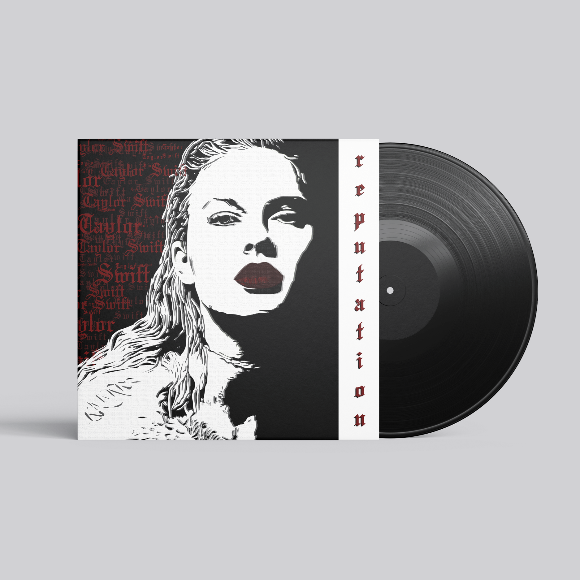
Vinyl Remake: Reputation (My Version)
12.4 x 12.4 x 0.4 Vinyl Sleeve
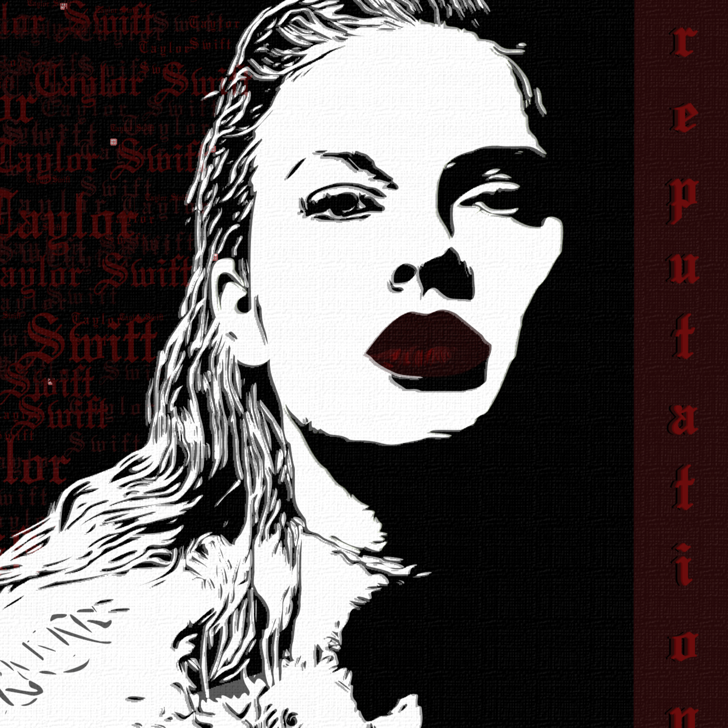
For this project, I was challenged to recreate an existing vinyl cover using only Adobe Illustrator with no photographs or raster imagery. I chose Taylor Swift’s Reputation and developed my own interpretation of the album’s visual identity. This meant breaking the original cover down into shapes, values, and textures, then rebuilding every element through vector illustration. The result is a stylized, graphic reinterpretation that captures the attitude and tone of the album while showcasing a fully illustrated approach.

Initial Research
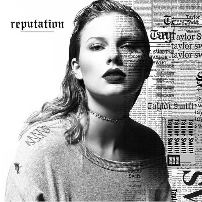
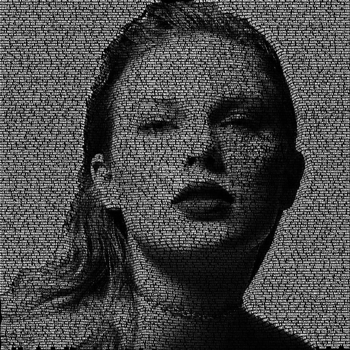
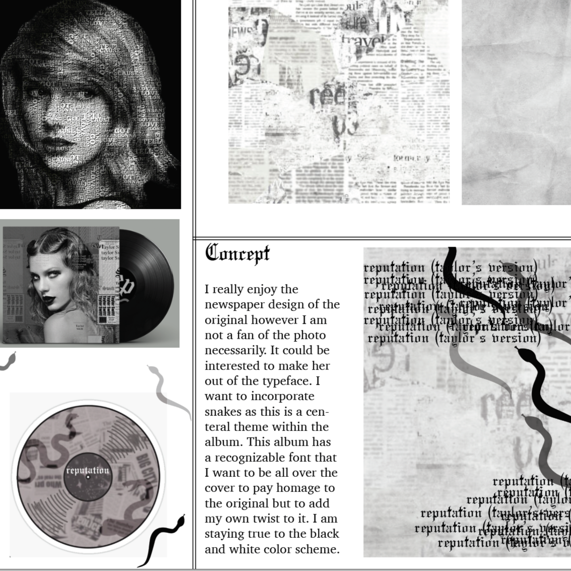
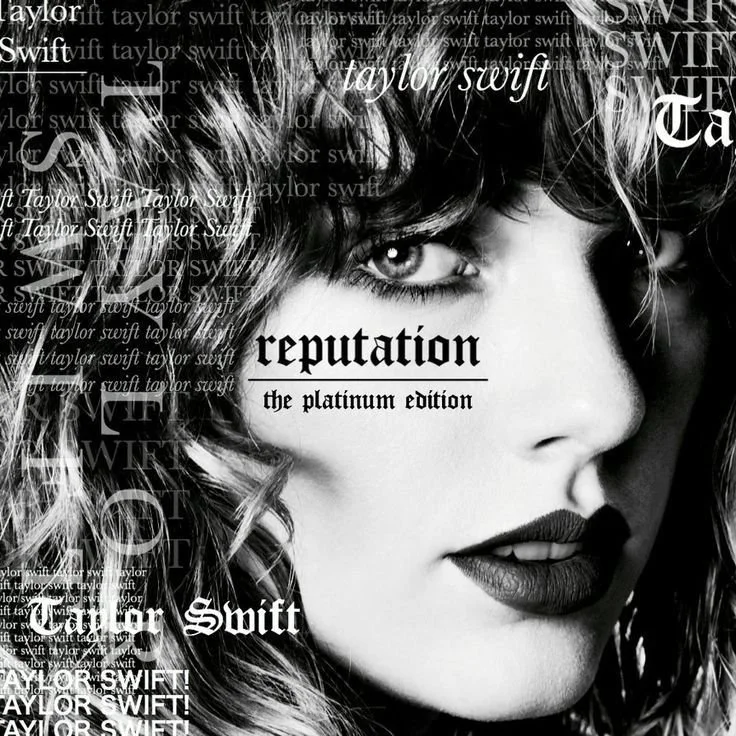
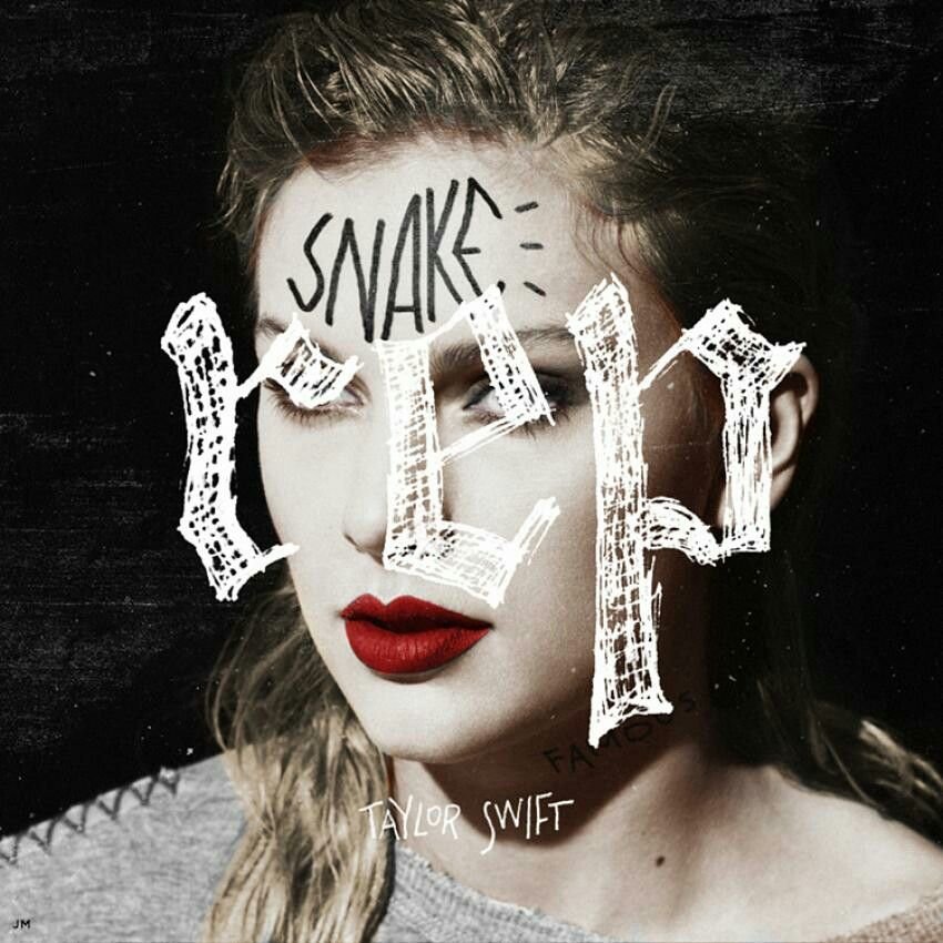
I began by gathering a range of references from Taylor Swift’s Reputation era, focusing on the typography, textures, and visual tone that define the album. I looked at the official artwork along with other reinterpretations to study how black and white contrasts, layered text, and bold graphic elements shape the overall aesthetic. Understanding these variations helped me identify which stylistic choices were essential to the album’s identity and which elements I could reinterpret through vector illustration. This research set the foundation for the visual direction of my remake.
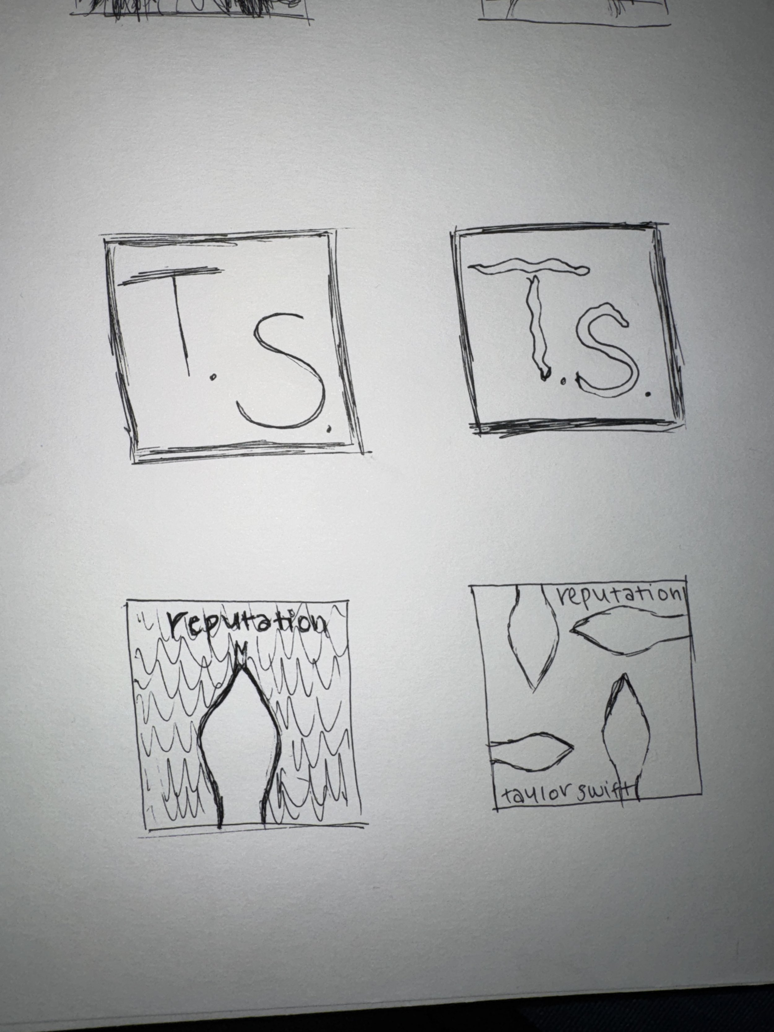
Sketch’s & Ideas
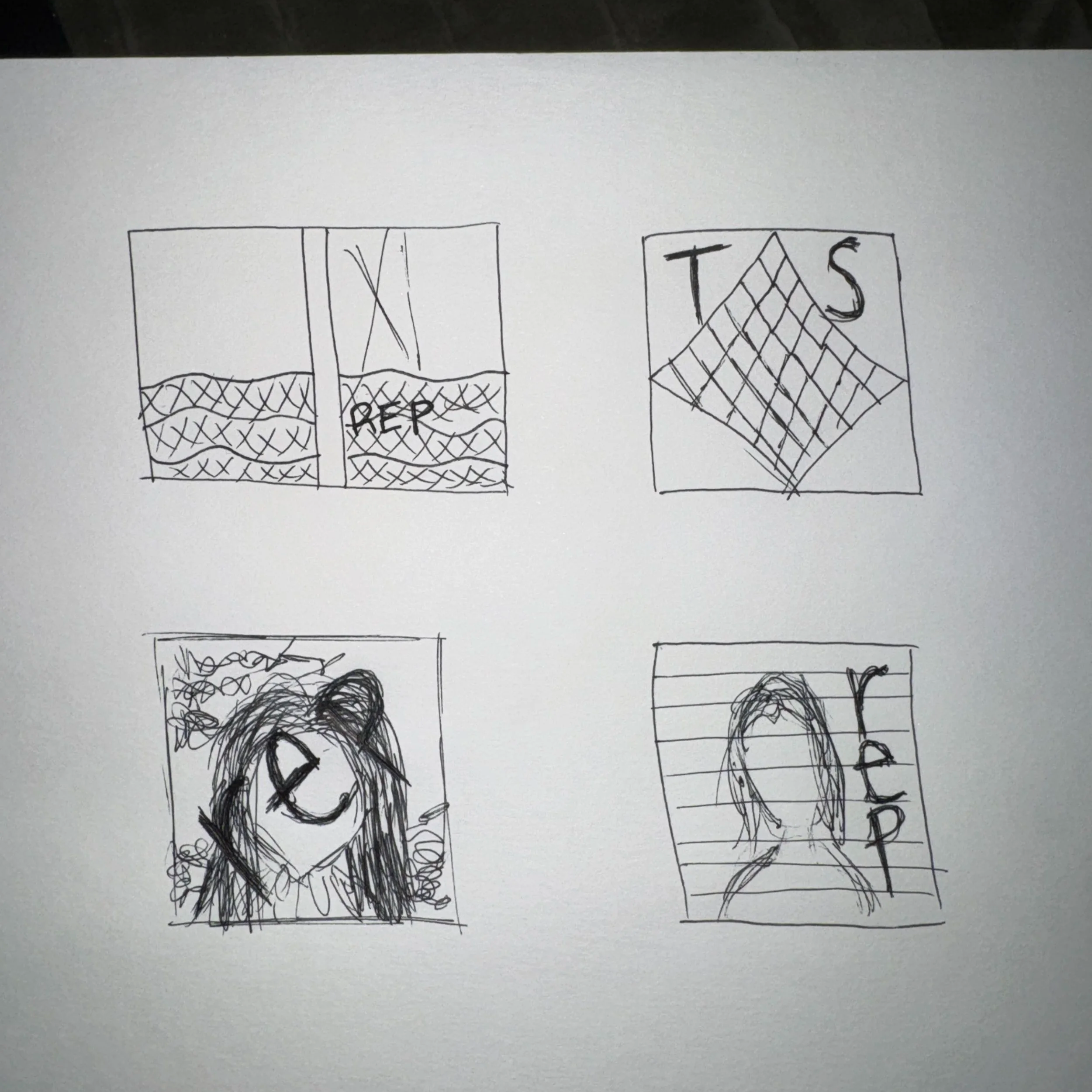
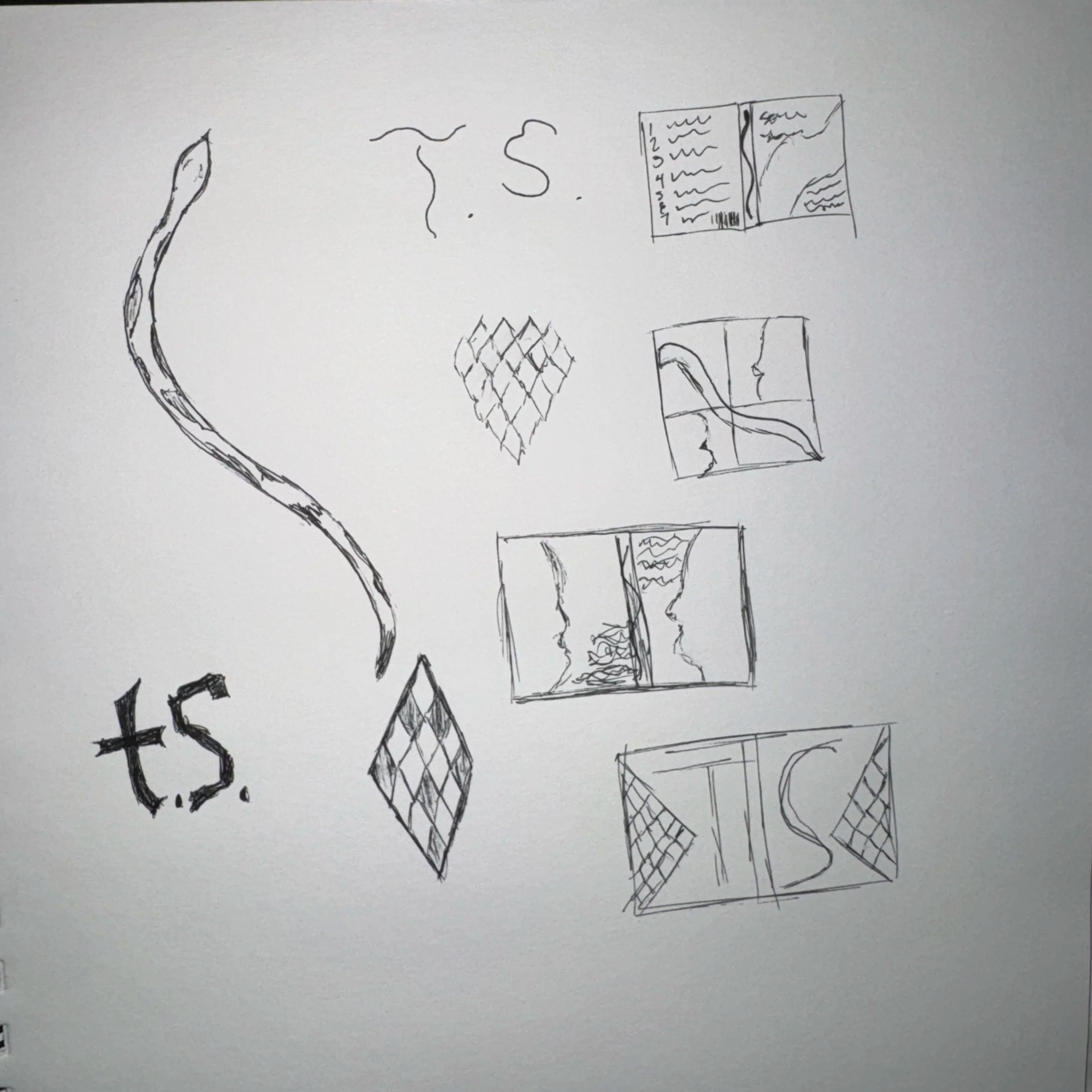
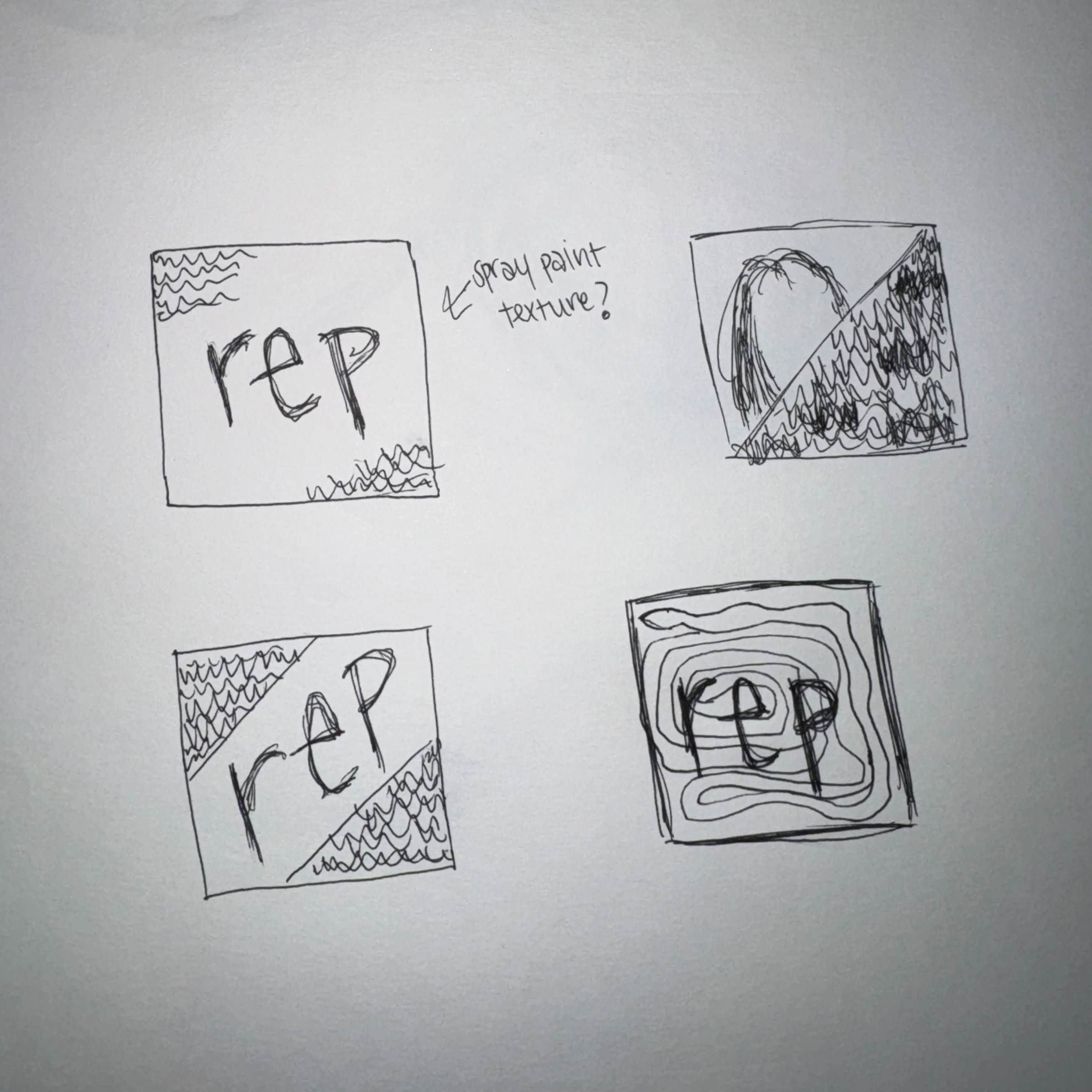
My early sketches were focused on exploring different ways to reinterpret the Reputation aesthetic using only vector illustration. I experimented with layouts, lettering, and iconography that referenced key elements from the era, such as newspaper textures, bold type, and high-contrast portrait forms. These quick drawings helped me break down the visual language of the original album and decide which components I wanted to emphasize or transform.
From there, I used rough thumbnails to test composition ideas, including how to illustrate the central figure, where to place text, and how to balance graphic shapes with negative space. These early sketches set the groundwork for my final concept and helped clarify the direction before moving into more refined digital illustration.

Iterations
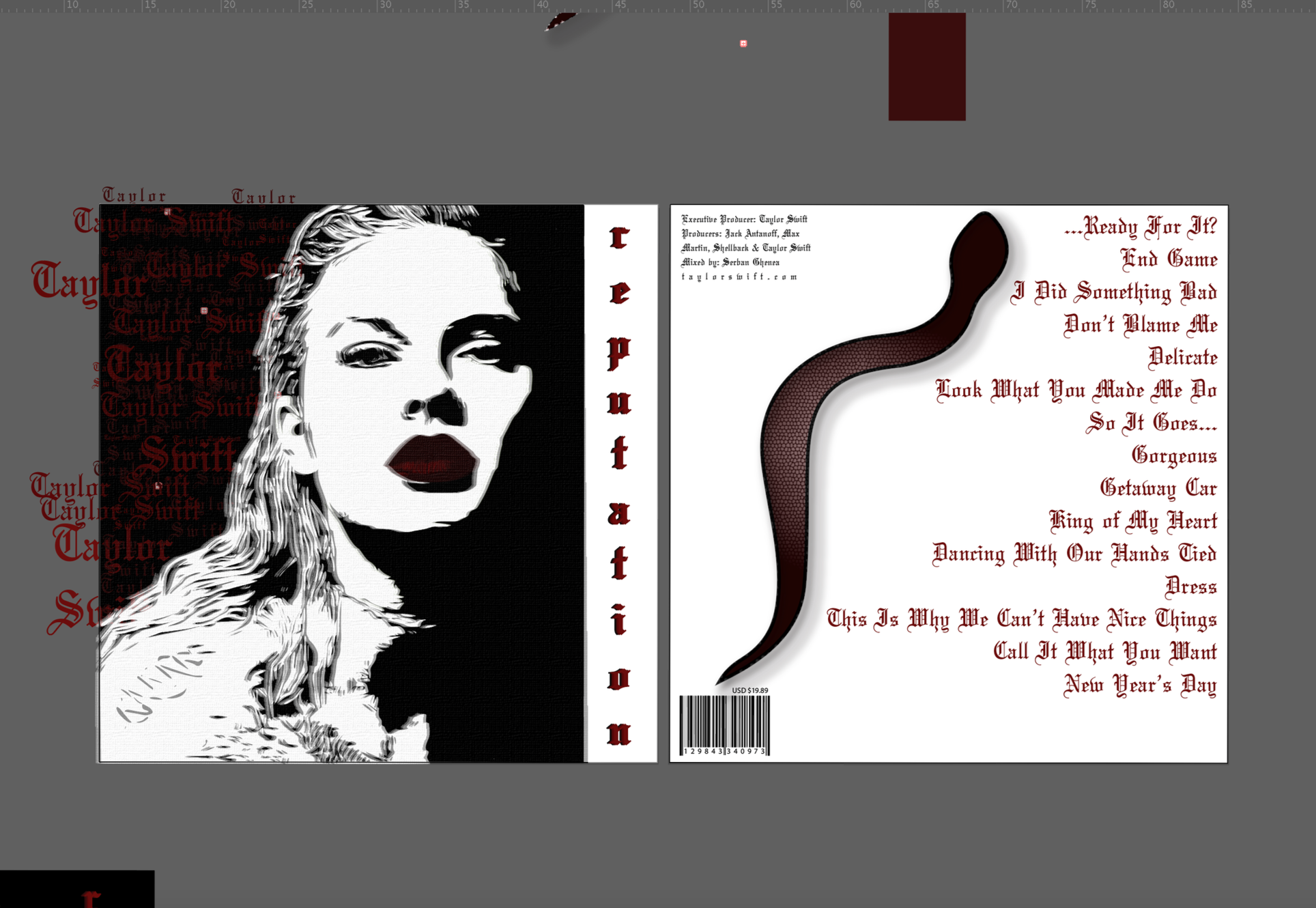
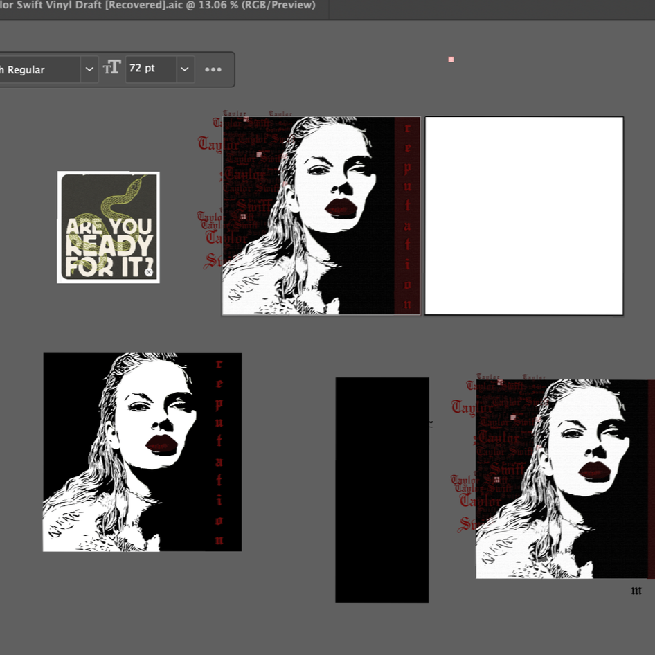
As I moved into digital illustration, I began testing how the vector portrait, textures, and typography worked together at full scale. Each iteration focused on refining the balance between the stark black and white portrait and the deep red accents that define the mood of the album. I experimented with placement, proportions, and layering techniques to create depth without relying on any raster imagery. Throughout this stage, I adjusted the background textures, letterforms, and contrast levels to achieve a cohesive visual tone. These iterations helped me refine the final composition and ensure that every element felt intentional and aligned with the Reputation aesthetic.
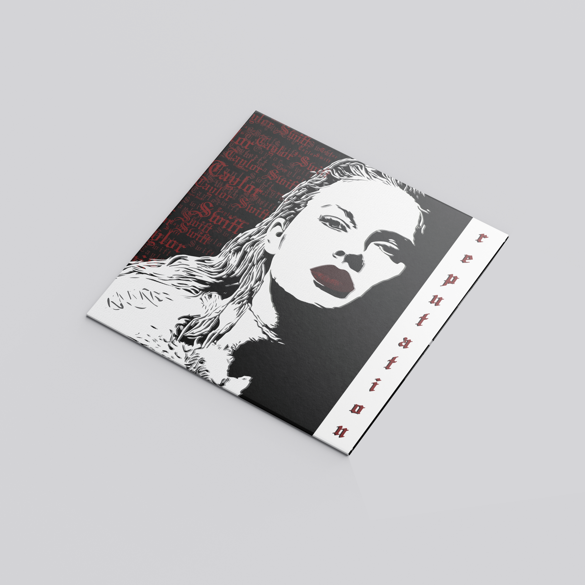
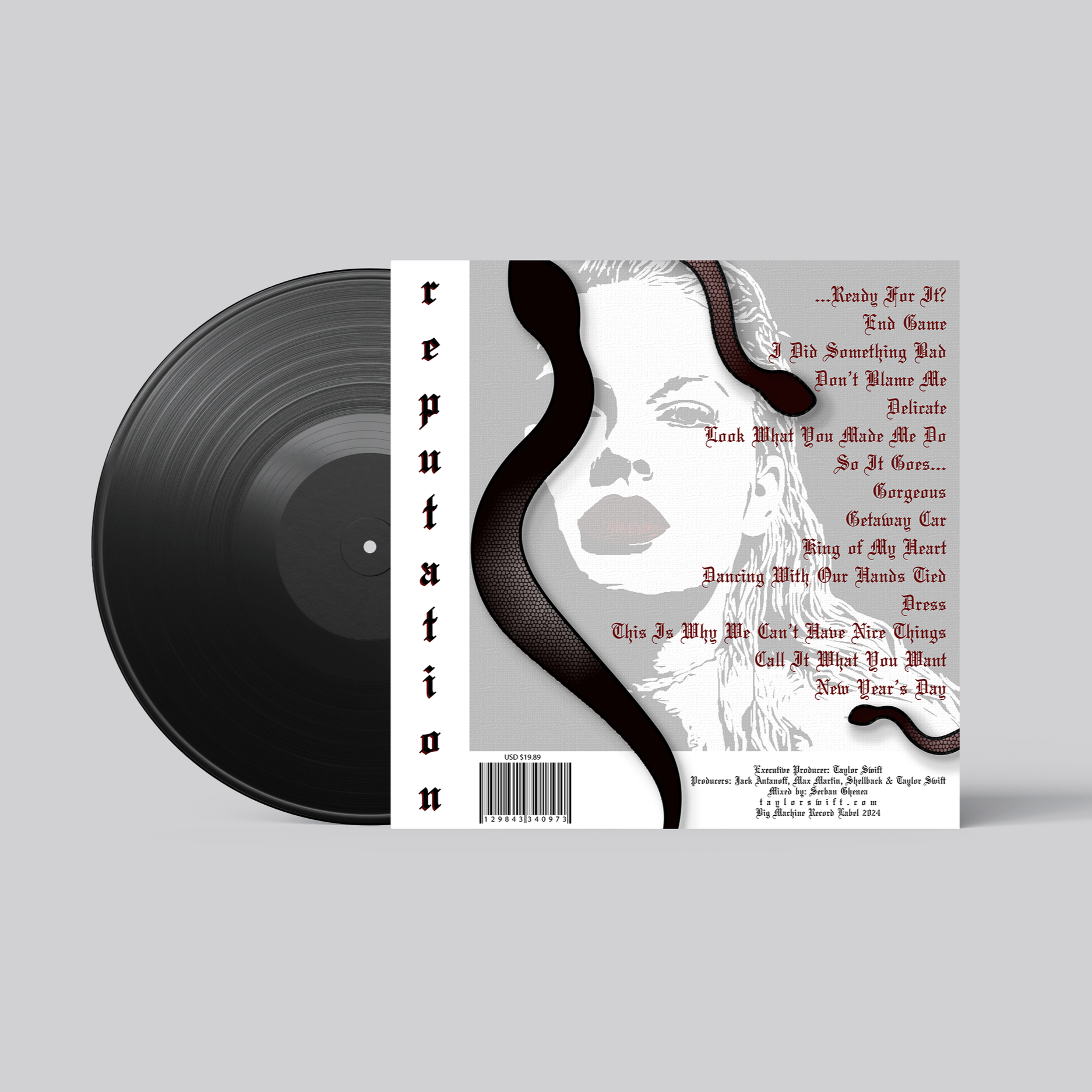
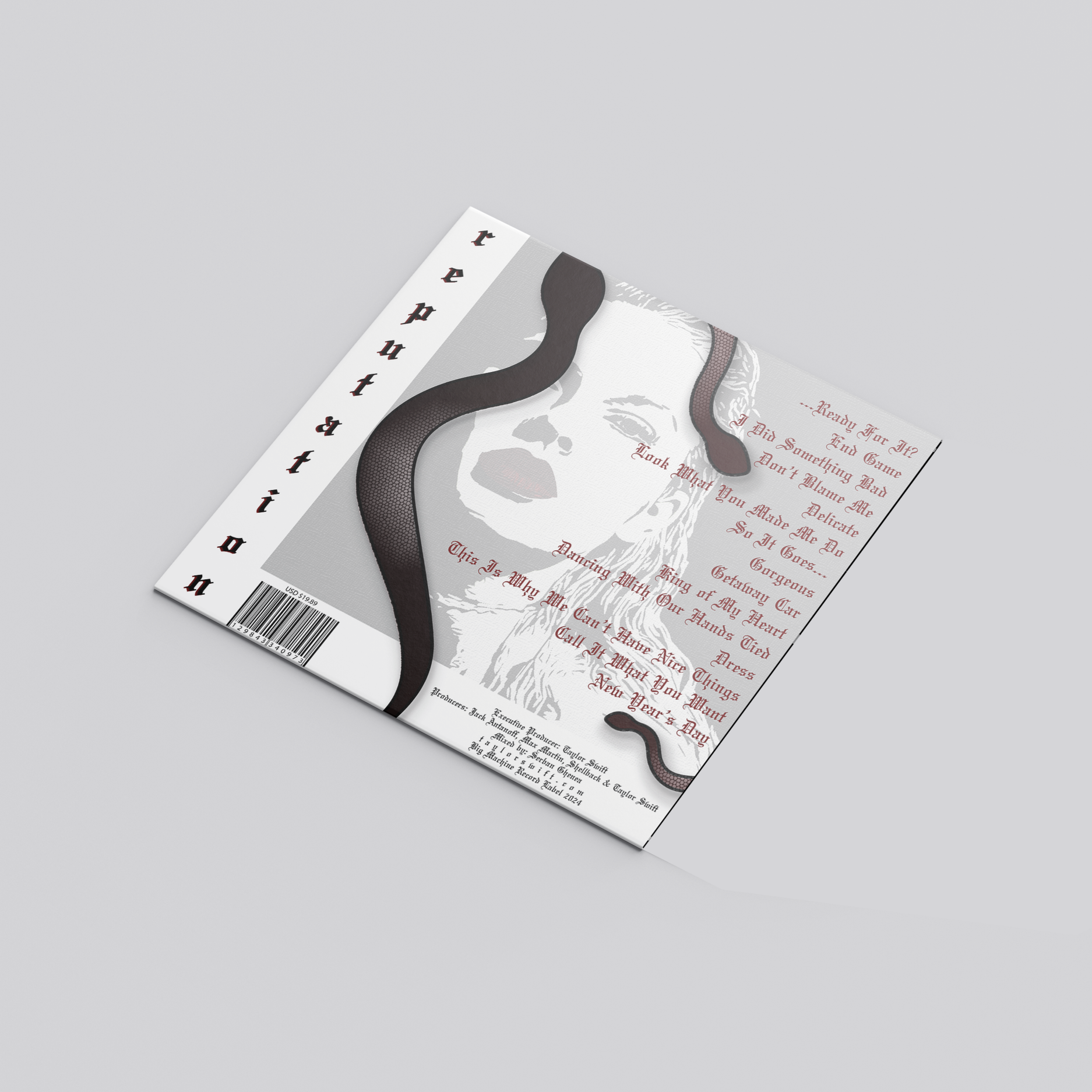
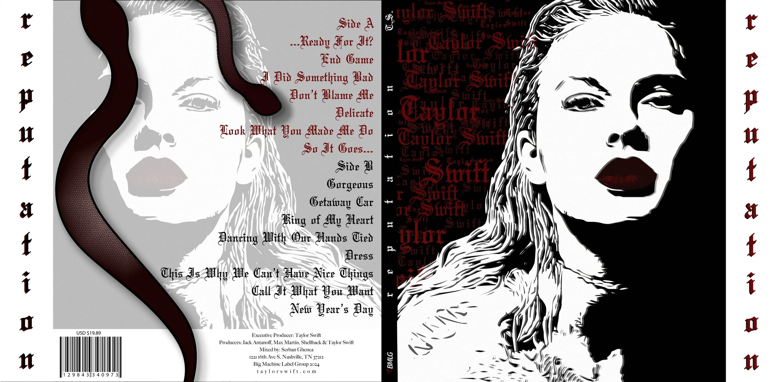
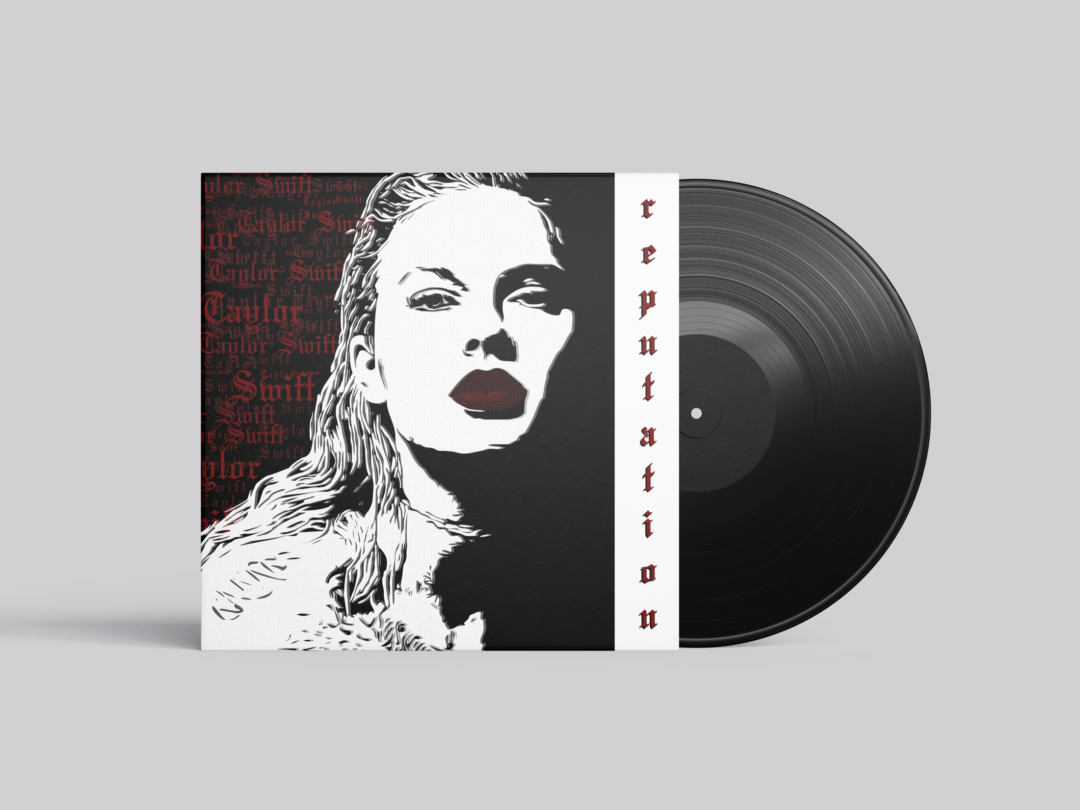
Final Design
In the final design stage, I refined the full composition, focusing on how the portrait, textures, and typography worked together across the front and back of the sleeve. I leaned into a stark black, white, and red palette to capture the bold attitude of the Reputation era while still making the illustration the central focus. During this phase, I finalized the layout, adjusted the contrast and detailing in the vector portrait, and refined the placement of type and background elements to create a cohesive system. These decisions brought the illustrated concept together and shaped the final version of the vinyl sleeve shown here. View up close below.