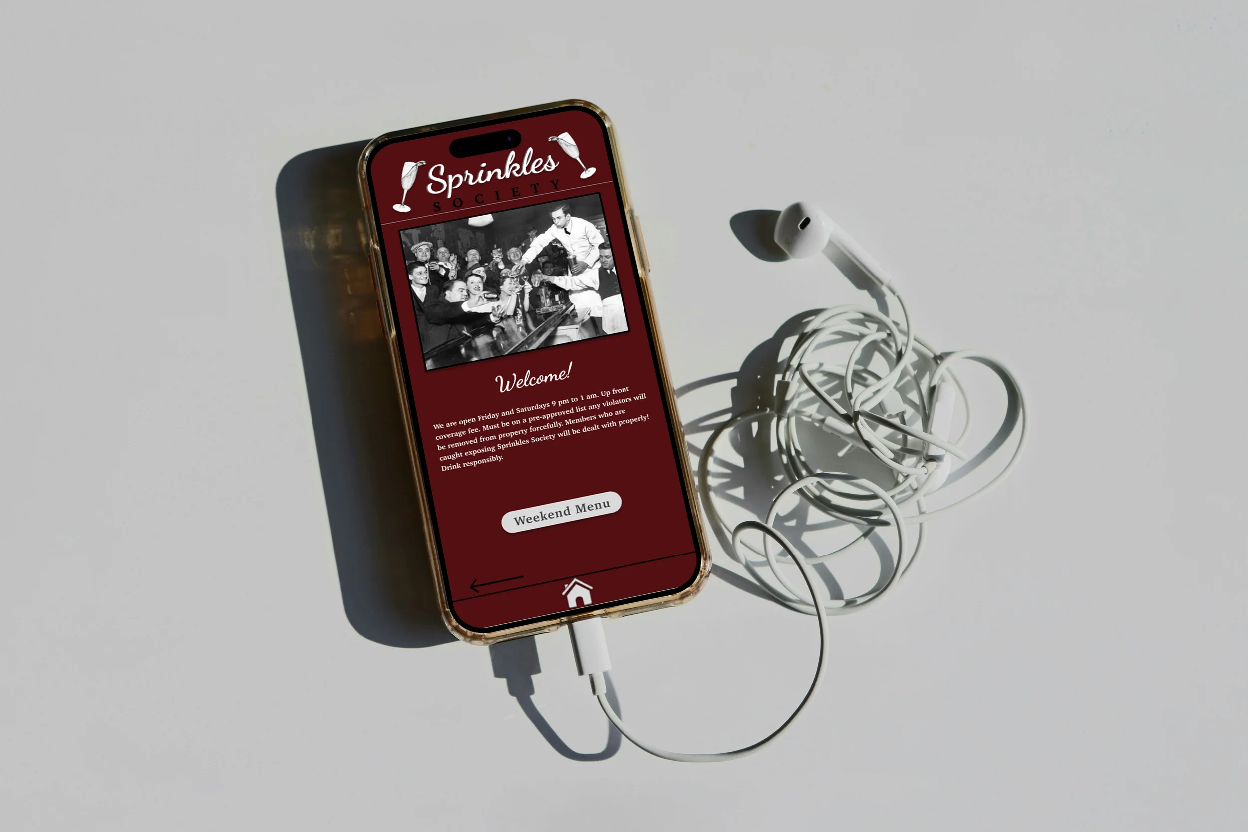
Sprinkles
Figma Mobile App Prototype
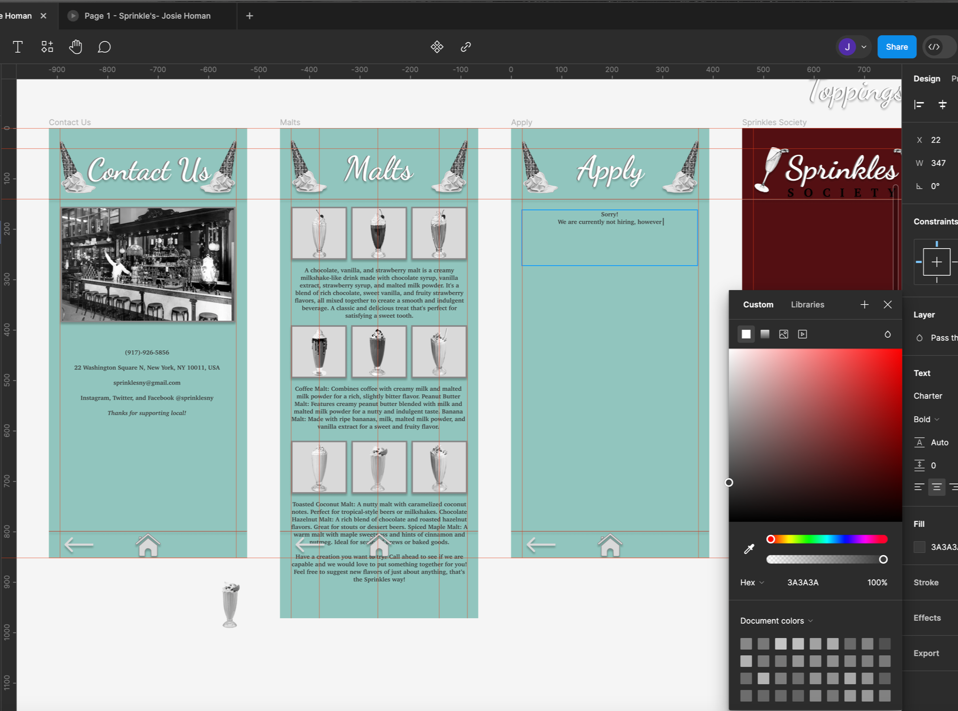
For this project, we selected a random location and time period, then were assigned a store to design a mobile app for. I was given a small ice cream shop and built a digital experience that captured its personality while keeping the interface simple and intuitive. Using Figma, I developed a full prototype that highlights flavors, toppings, specialty items, and shop information through a clean card-based layout.
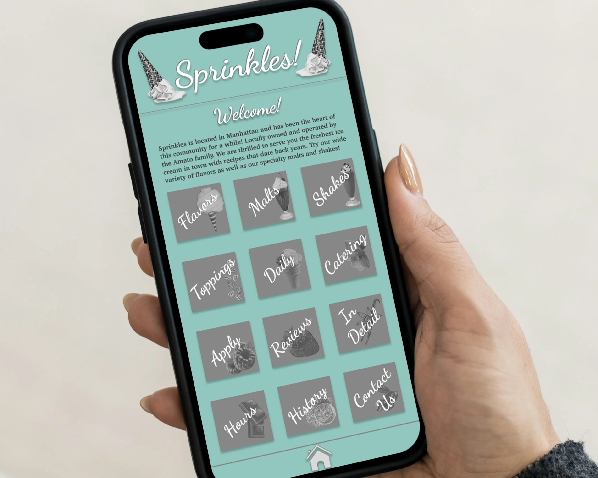
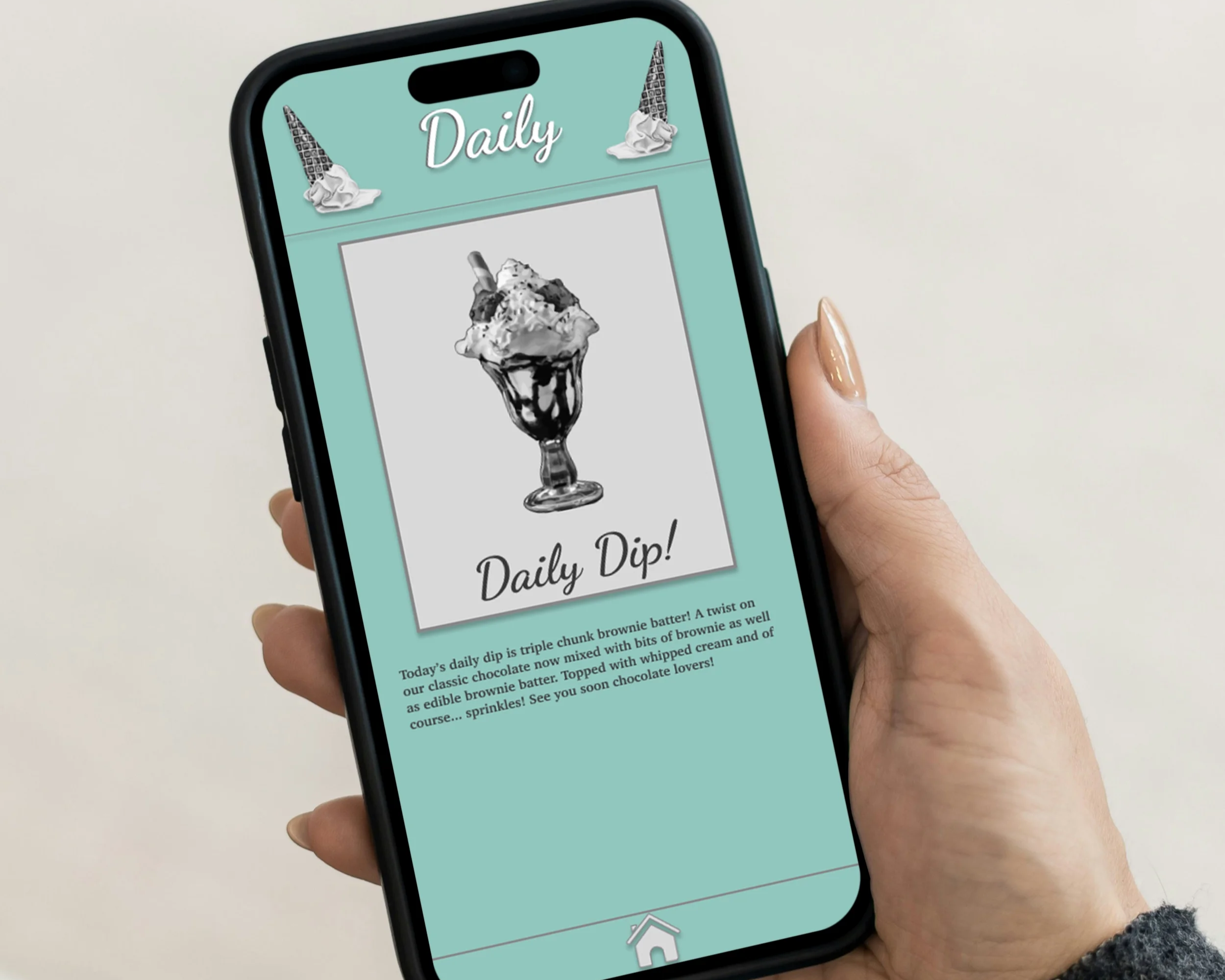
The final design shows how the brand would function on a mobile platform, from the welcome screen through each category. My focus was on clarity, charm, and creating a system that feels approachable for any user. This project strengthened my skills in mobile UI, interaction flow, and building a cohesive visual language for a fictional but fully realized business.
Initial Research
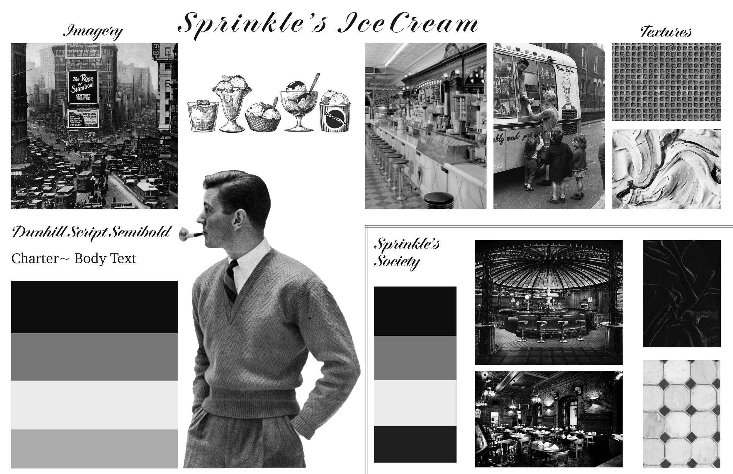
I began this project by drawing a random business, which determined the type of store I would design an app for. After pulling an ice cream shop, I chose 1920s Manhattan as the setting to shape the tone, visuals, and atmosphere of the brand. This helped me imagine how the shop would look, operate, and communicate within its era.
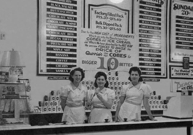
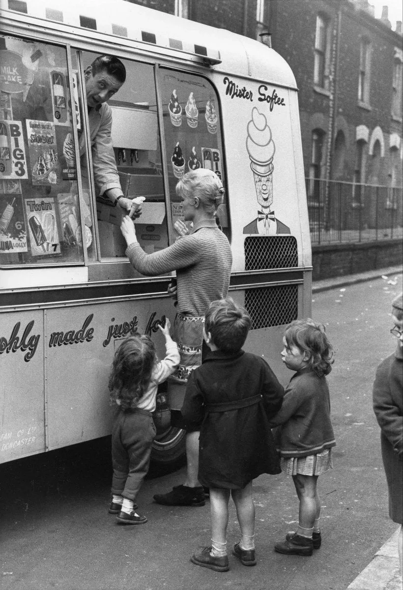
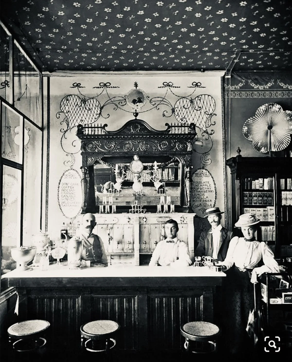
I collected imagery and references that captured mid-century Manhattan ice cream culture, focusing on interior styling, typography, signage, and street life. Building a research board allowed me to identify visual patterns and historical details that guided my early design decisions. This research phase grounded the concept in a believable context and ensured the final prototype felt intentional and true to its chosen setting.
Iterations
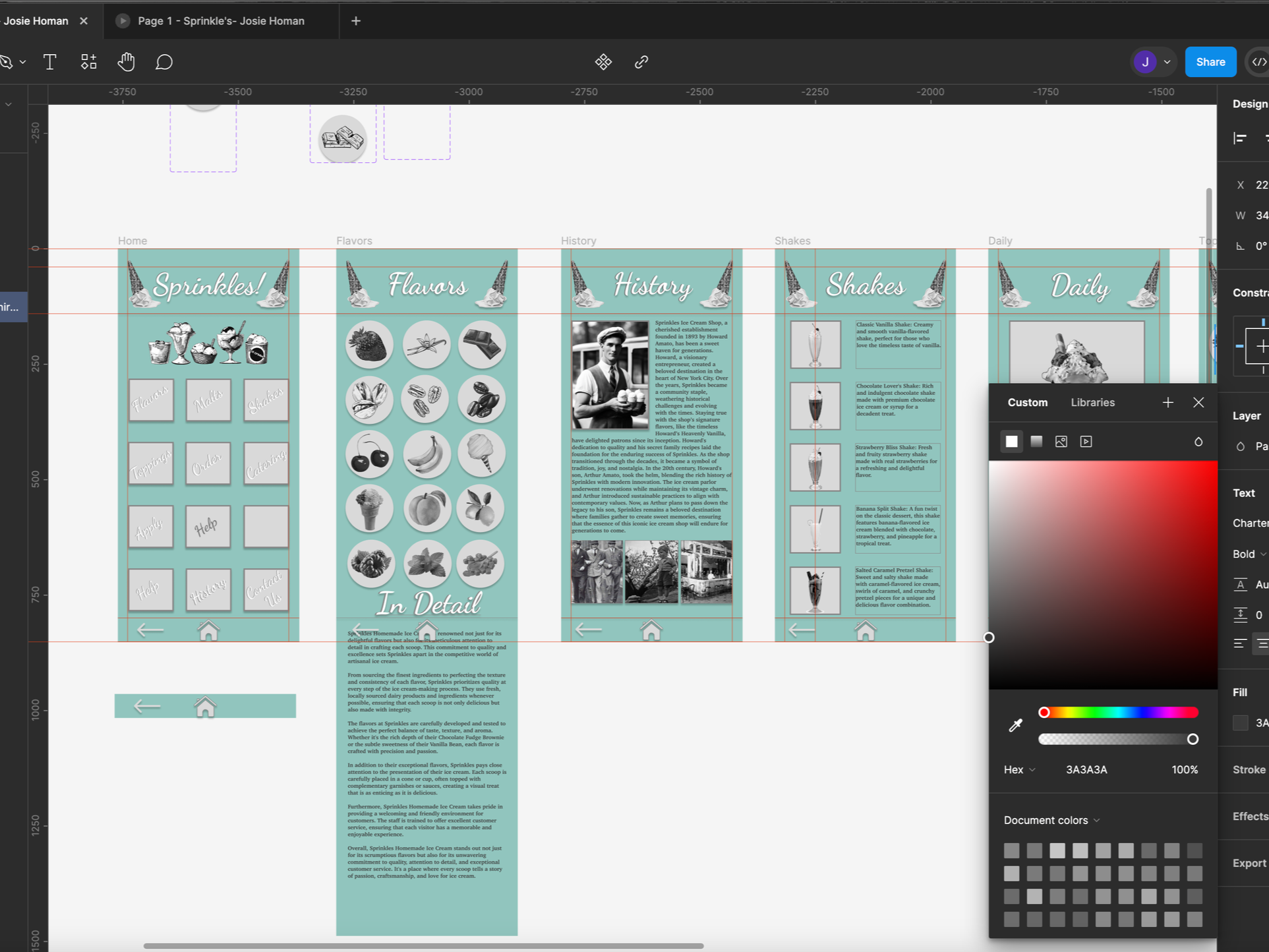
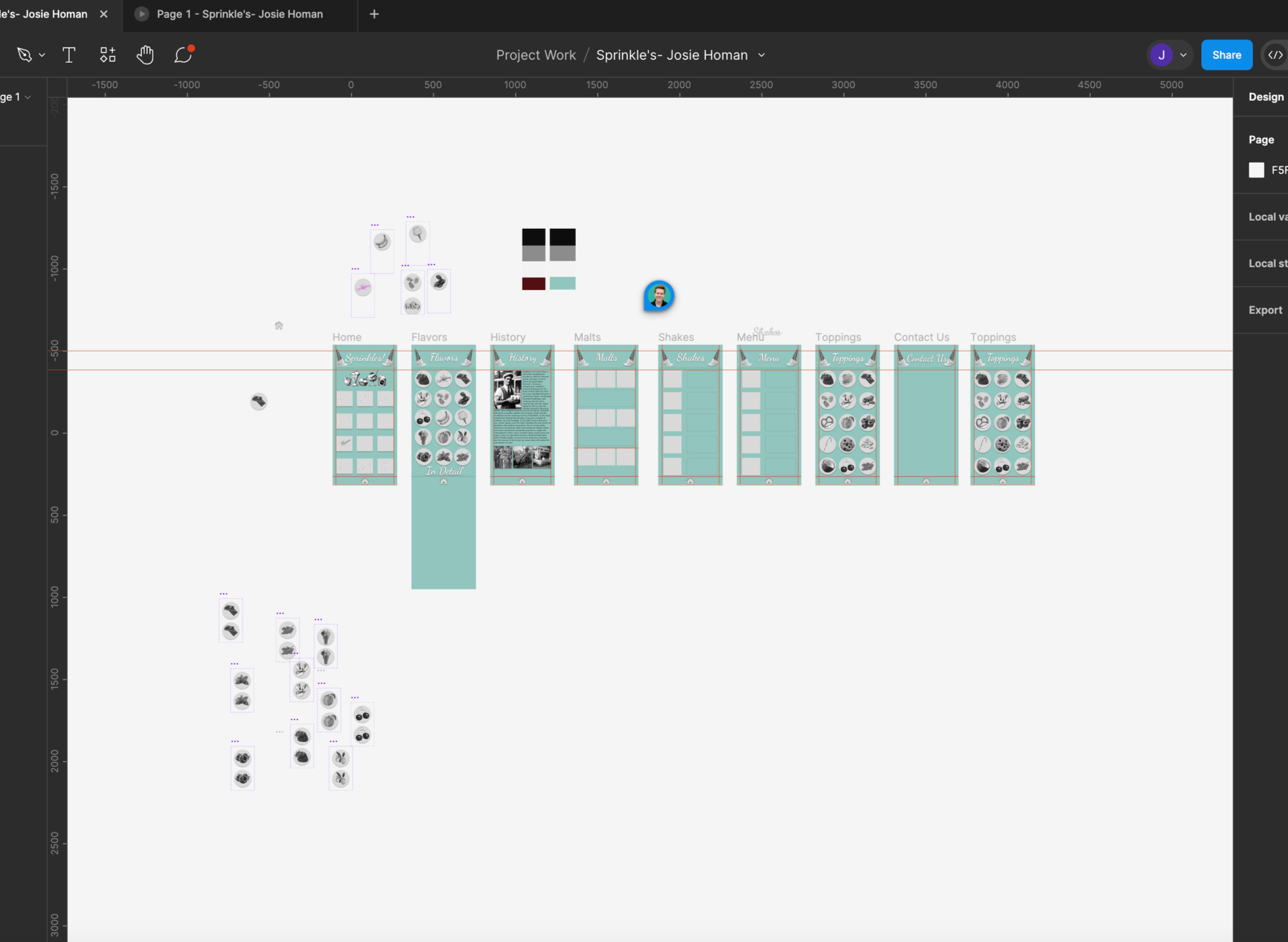
In this stage I focused on developing the visual direction and building out my screens in Figma. I wanted the app to feel rooted in 1920s Manhattan while adding a subtle speakeasy influence, creating moments that felt intentionally hidden or less direct, similar to how a real speakeasy is discovered rather than immediately obvious.
I refined layouts, icons, and hierarchy while testing how each screen flowed together. These iterations helped me balance clarity with small elements of discovery, shaping a system that felt playful, era-appropriate, and true to the concept.

Final Mockups
In this stage I brought the screens into context through final mockups to see how the app would feel in real use. Placing the designs on devices helped me understand how the interface read at scale, how the visual system held up, and how users might move through each screen. This step gave me a clear sense of how the app could function in everyday use and confirmed that the design choices worked as a cohesive experience.
Final Design
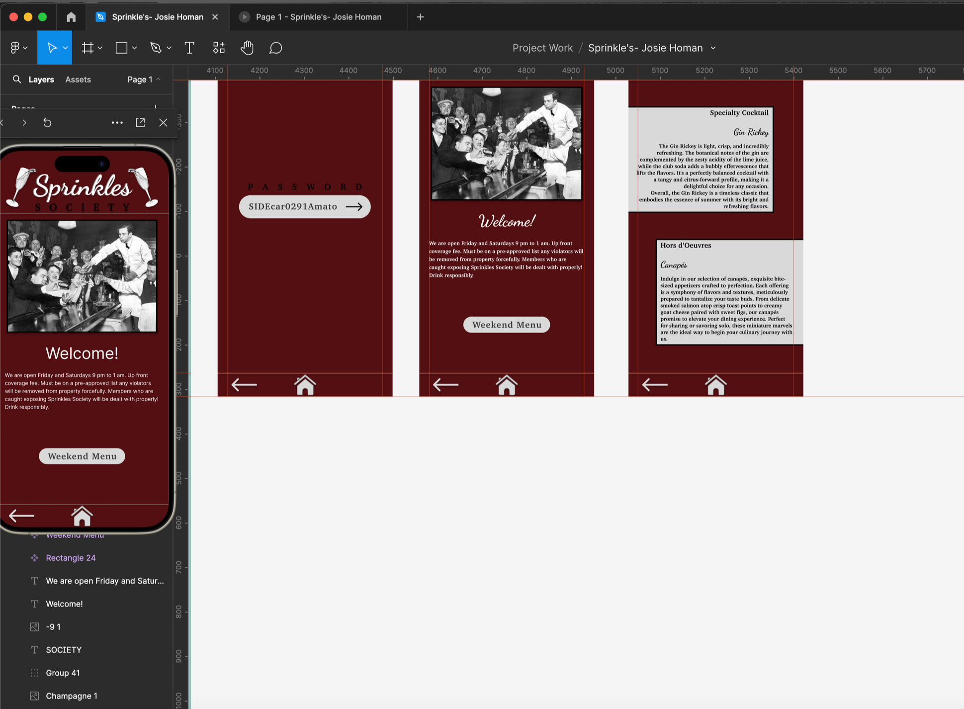
I created a full Figma prototype that brings the Sprinkles app to life within its 1920s Manhattan setting. The final design focuses on a friendly, nostalgic interface with subtle speakeasy influences woven throughout the experience. Each screen was built to reflect the visual style of the era while still feeling functional and intuitive for a modern user.
The prototype includes all core pages, iconography, and interactions, showing how the system works together as a complete mobile experience. You can explore the full Figma file through the link on the right and navigate the app the way a real customer would. See if you can find Sprinkles Society while you’re in there.