
Short Leg Brewing
Primary Logo, Secondary Logo, Coaster, Pint Glass, Signage, T-shirt, Social Media
Short Leg Brewing is a brand concept created for a design project centered on building a visual identity from the ground up. The prompt paired a randomly picked animal with a business of our choosing, and I was given a dog and chose to build a brewery brand around it. From there, the goal was to merge personality, storytelling, and clear communication into a cohesive system for a dog-friendly craft brewery. Inspired by the charm and character of dachshunds, the brand combines playful illustration with clean typography to create a warm, welcoming atmosphere. Below, I break down the development of the logo, supporting graphics, and branded applications that bring Short Leg Brewing to life.
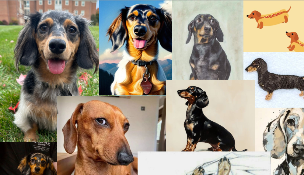
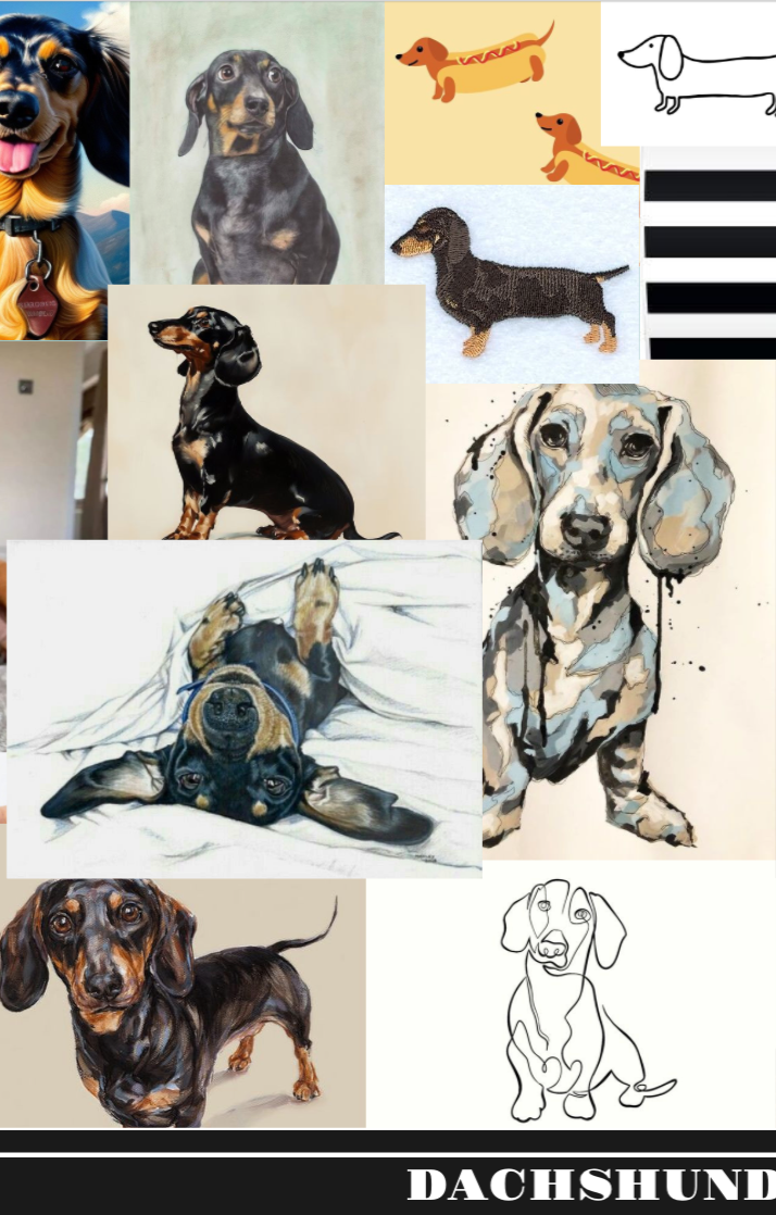
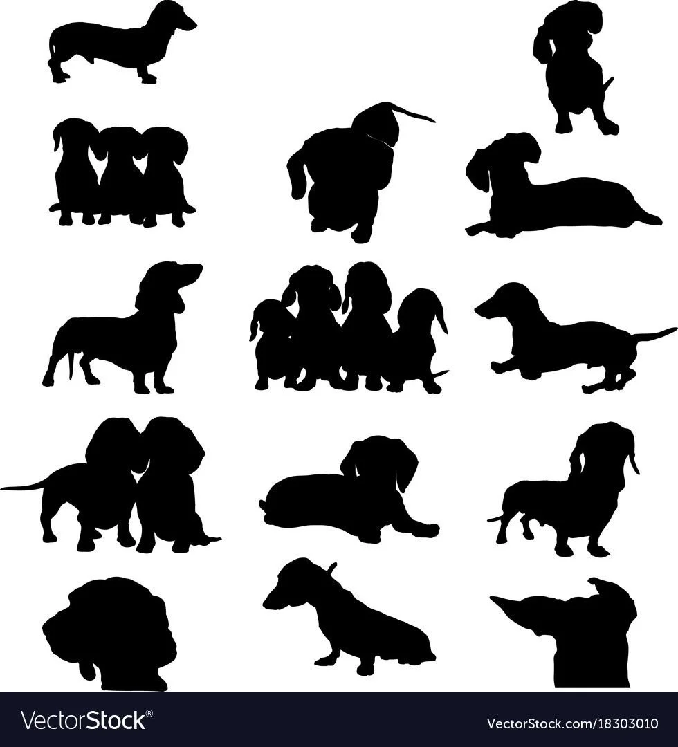
Initial Research
For the research phase, we were asked to randomly pick an animal and study the many ways it can be represented. The goal was to break the subject down into its essential features and understand what visual elements make it instantly recognizable. I chose a dachshund because of my dog Haven, which made the exploration feel personal and engaging. I gathered references ranging from photography to illustration and silhouette studies, focusing on proportions, posture, and the signature long body and short legs that define the breed. This research became the foundation for developing a clear and consistent direction for the brand.
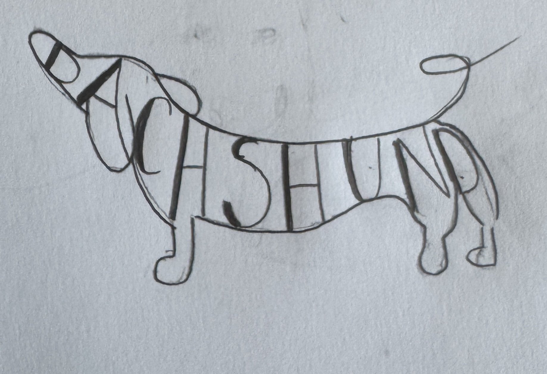

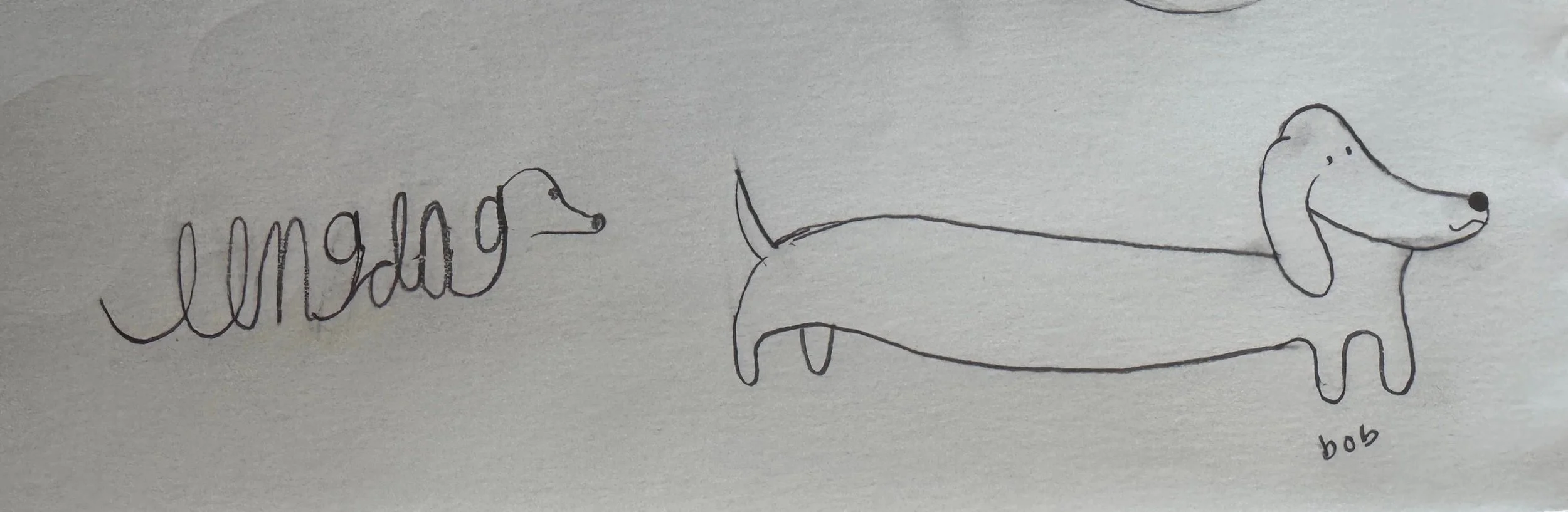
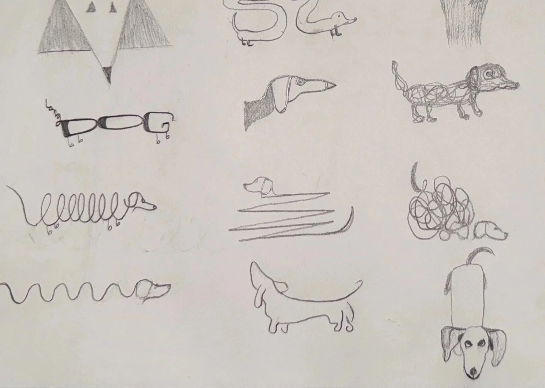
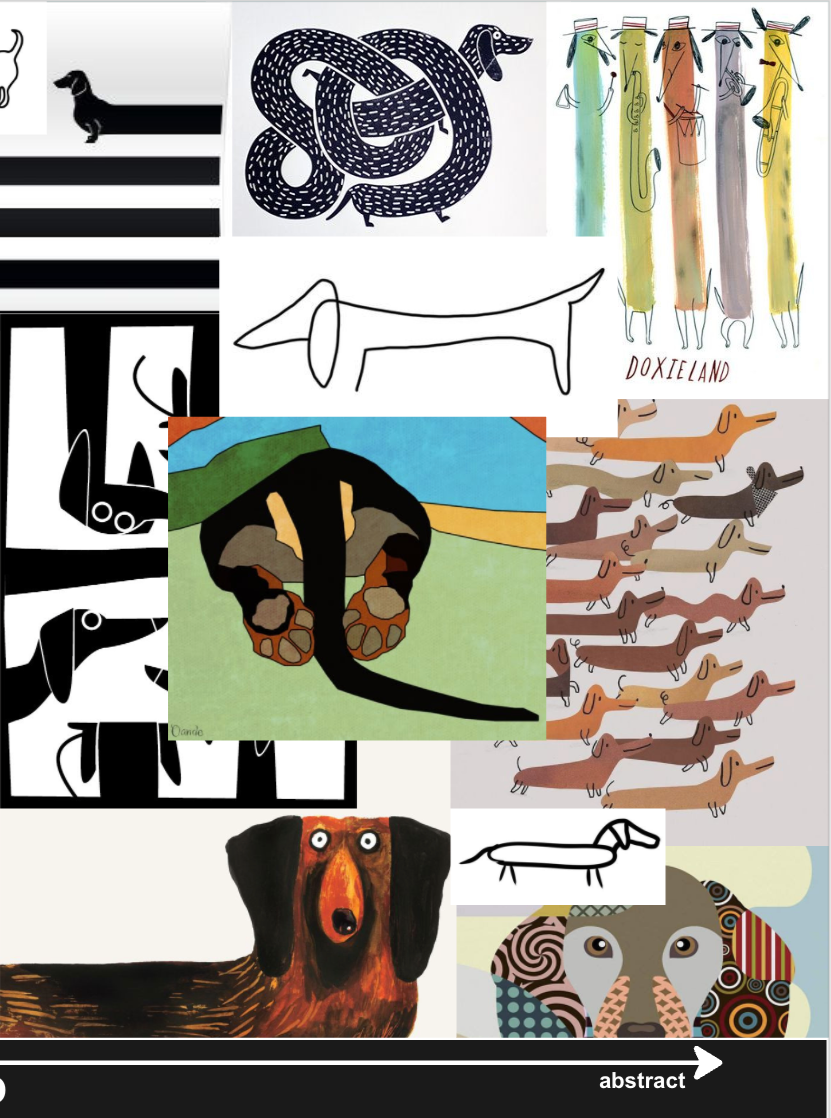
Sketch’s & Ideas
My early sketches were all about exploring the personality and recognizable features of a dachshund. I experimented with different proportions, silhouettes, and gestures to understand what visual elements were essential for capturing the breed. Some drawings stretched the long body into playful lettering, while others focused on simple outlines, exaggerated curves, or minimal line work.
These rough explorations helped me test a wide range of directions before committing to a more polished concept. By sketching freely, I was able to pinpoint the shapes, poses, and characteristics that made the dachshund feel charming, expressive, and instantly identifiable. This stage set the foundation for developing a clear visual voice for Short Leg Brewing.

Research #2
This stage is where the purpose of the animal study became clear. After breaking down our chosen animal into its essential visual traits, we were now tasked with creating a business and developing brand guidelines that incorporated that animal in a meaningful way. Studying existing brewery brands that use animals helped me understand how personality, illustration style, and tone can shape a company’s identity. This research prepared me to translate my earlier dachshund studies into a cohesive brand concept for Short Leg Brewing.
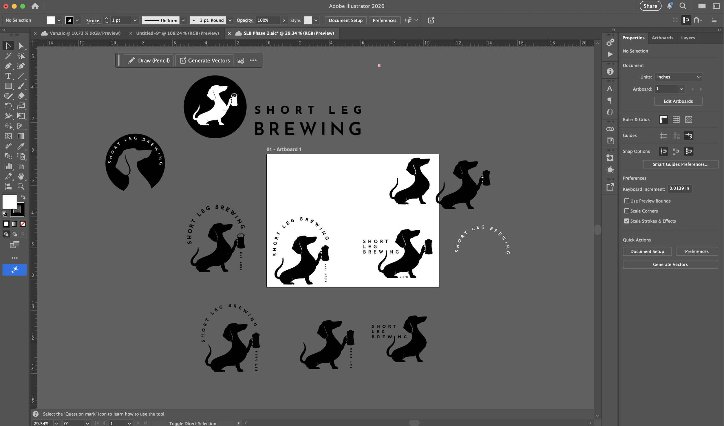
Iterations
The beginning rounds of iterations focused on exploring a wide range of brand mark possibilities. I experimented with different shapes, poses, and compositions to see how the dachshund could interact with the brewery’s identity. Some concepts leaned into circular badge-style marks, while others highlighted the silhouette on its own or paired it with type. These explorations helped me understand how playful, refined, or bold the mark could be and allowed me to narrow in on the direction that best expressed the personality I wanted Short Leg Brewing to embody.

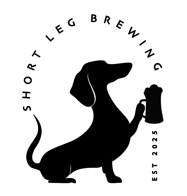
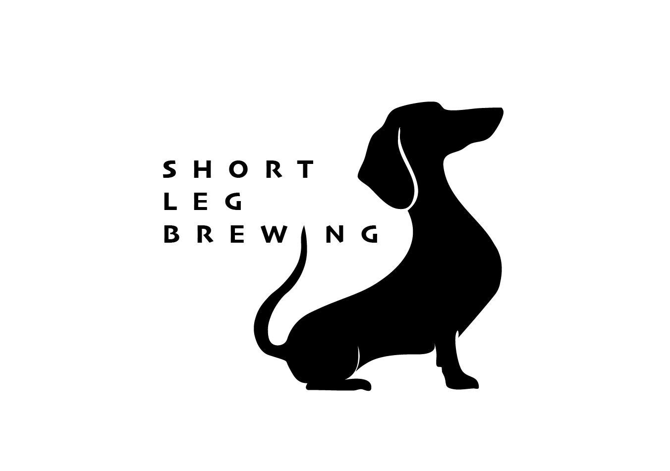
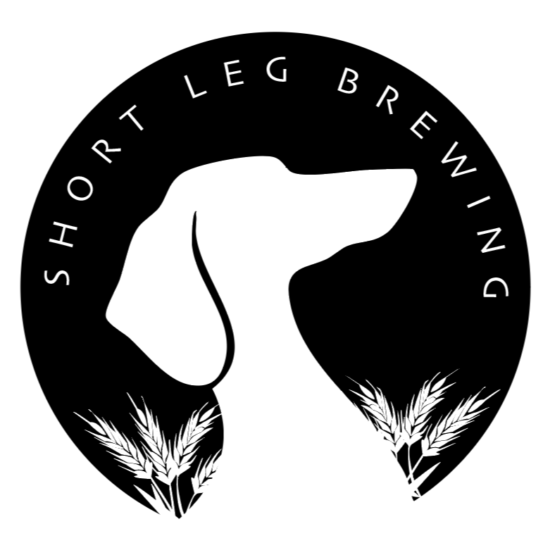
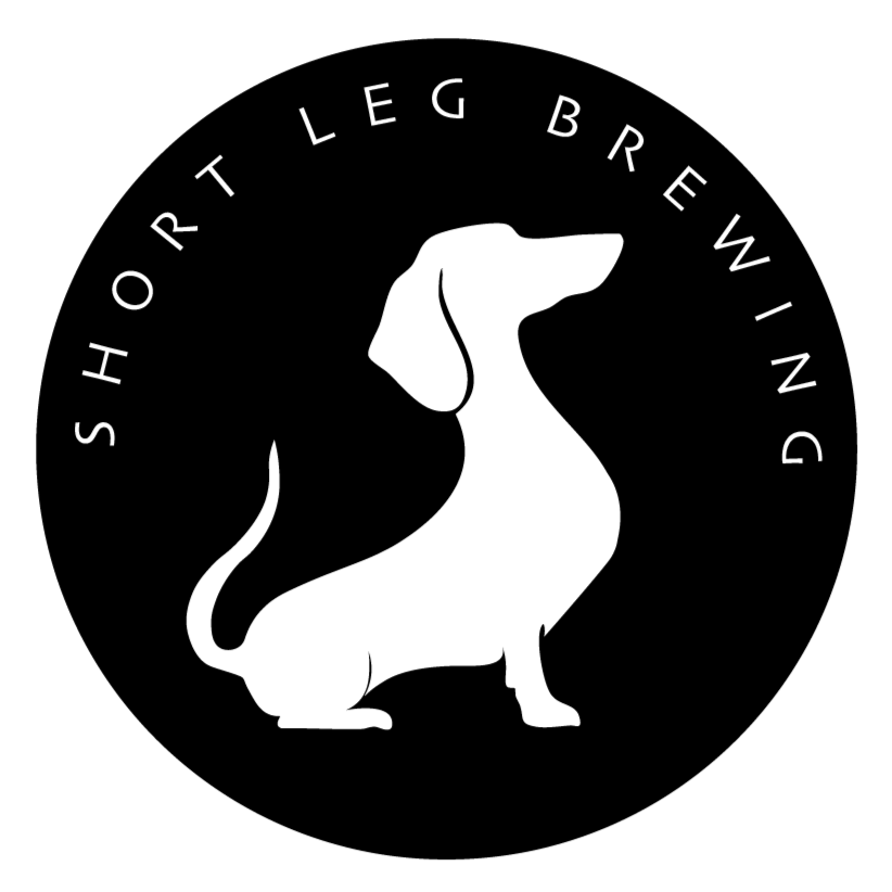
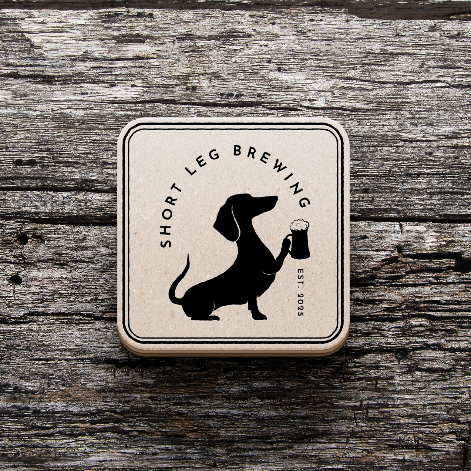
Final Logo
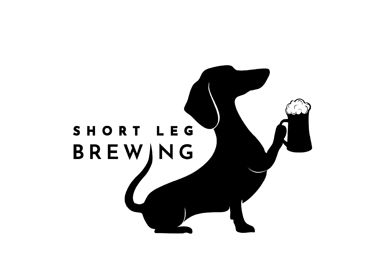
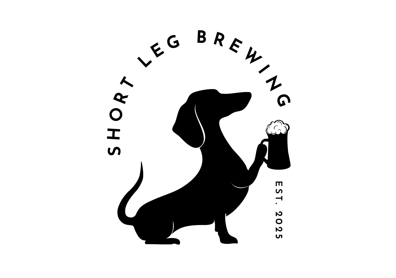
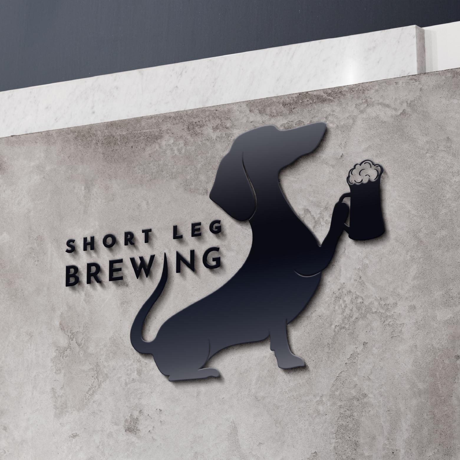
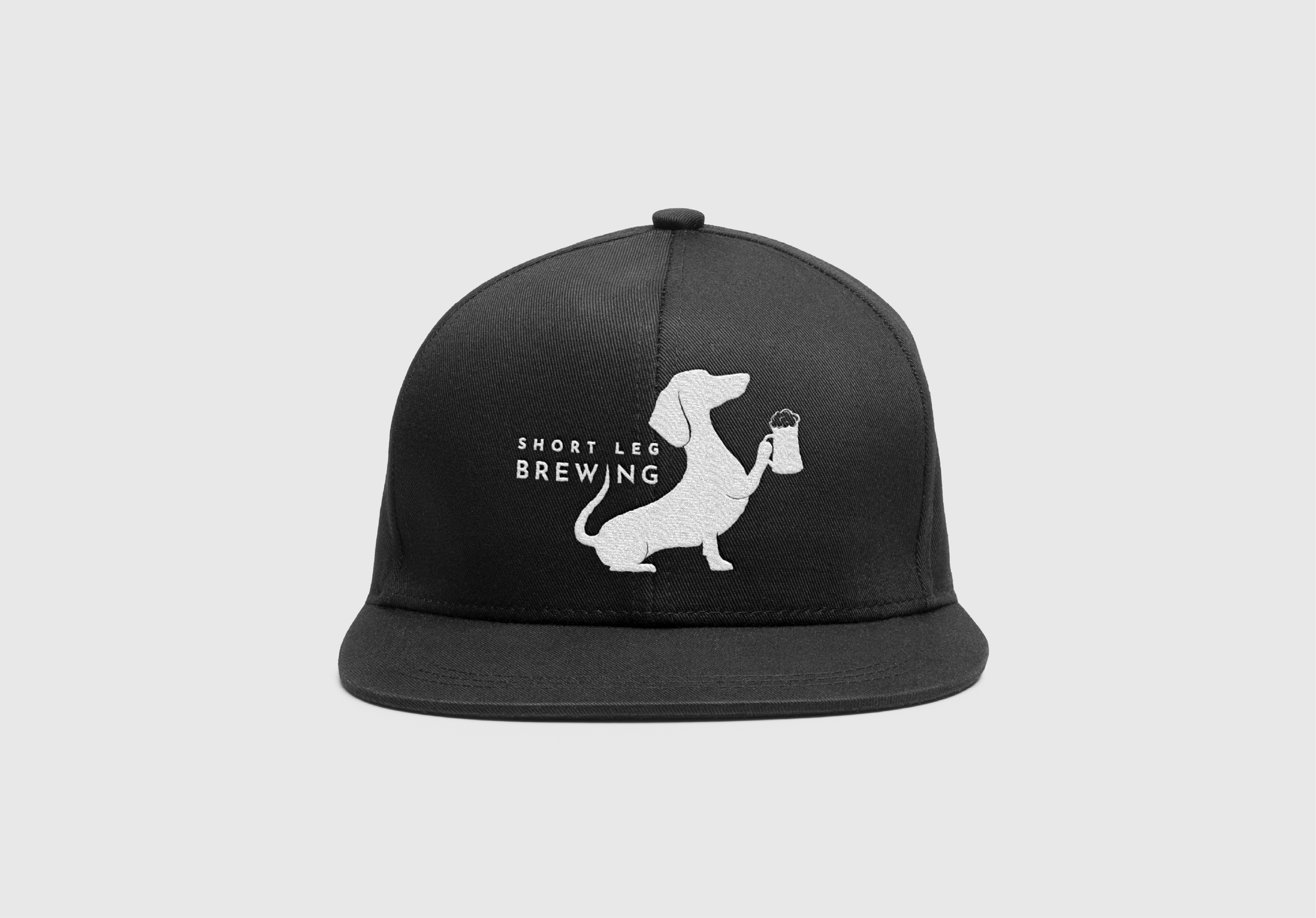
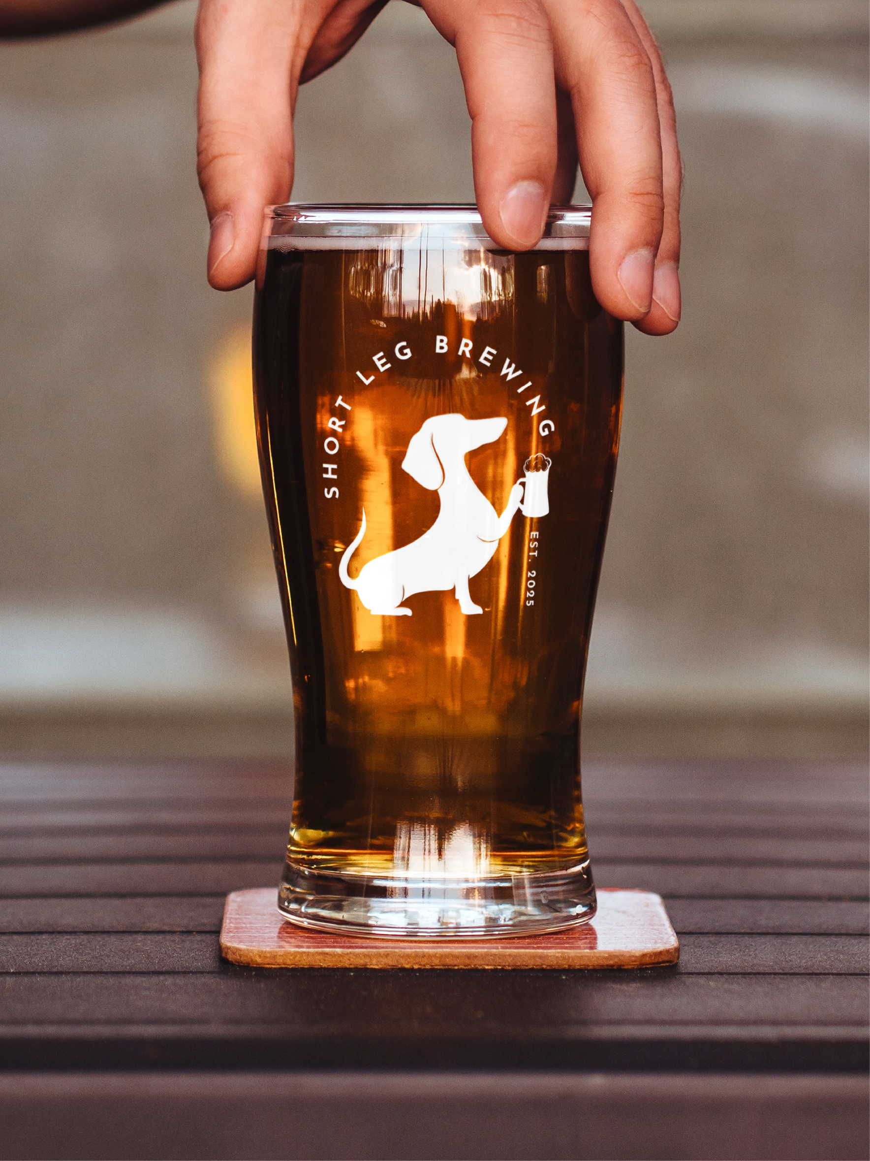
For the final logo development, I created two brand marks that could adapt to different applications. One functions as a circular badge style logo, while the other offers a more horizontal layout that pairs the illustration with the company name. I chose a black and white contrast to reinforce the industrial yet playful tone of the brand, keeping the marks bold, clean, and highly versatile. Having both options allows the identity to stay flexible across packaging, merchandise, signage, and digital use while still remaining true to the personality of Short Leg Brewing.
Brand Collateral
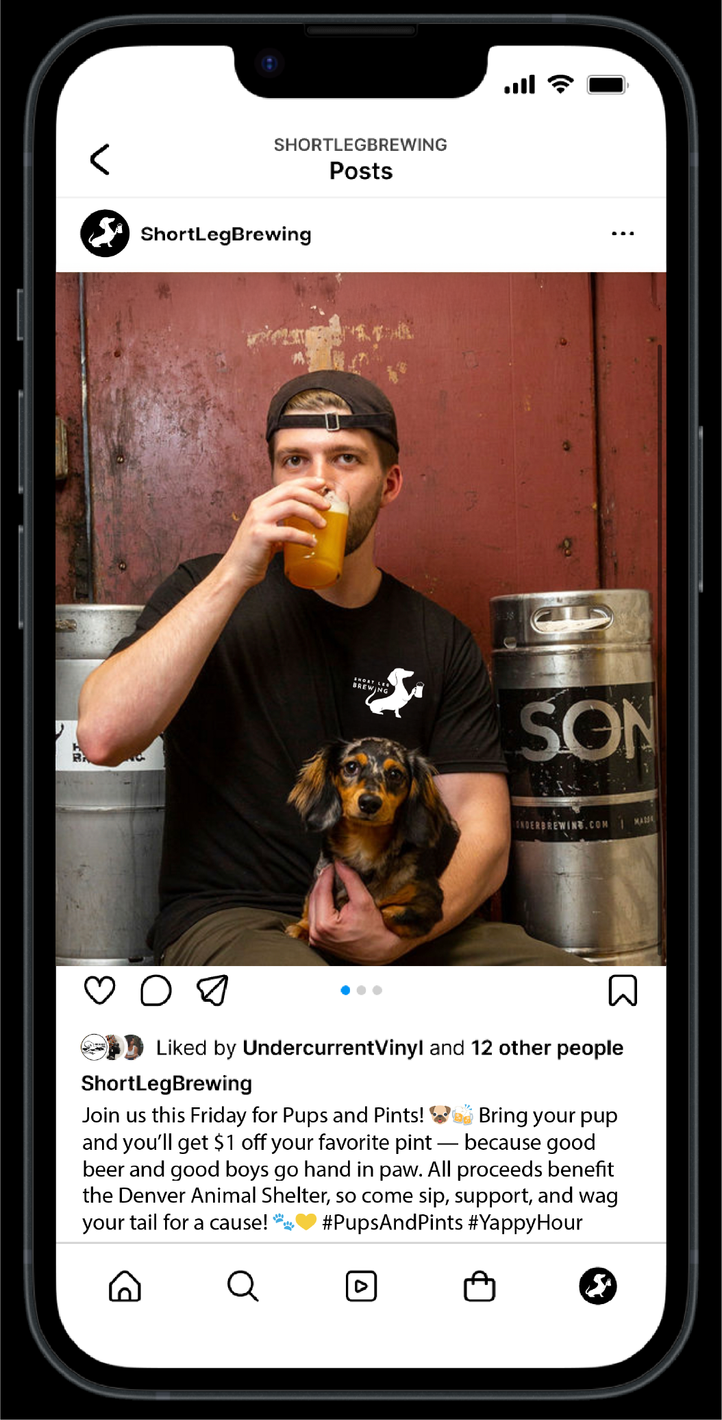
The brand collateral showcases how the identity extends across real-world applications, from merchandise to packaging to digital touchpoints. Using the two final brand marks and the black-and-white visual system, I created mockups to demonstrate how Short Leg Brewing could appear on apparel, signage, social media, vehicle graphics, and glassware. These applications highlight the flexibility of the mark and show how the playful yet industrial tone carries through every element of the brand. Together, these pieces help communicate a cohesive, recognizable identity that feels both memorable and authentic.

Brand Guidelines
The brand guidelines for Short Leg Brewing compile every core element of the identity into one cohesive system, outlining the mission, tone, visual direction, and design decisions that shape the brand. The document establishes clear standards for logo usage, color, typography, imagery, and voice, ensuring the brewery’s personality stays consistent across all touchpoints.
As the final piece of the project, the guidelines reflect the full development of the brand from initial research through iterations and refinement. This organized framework demonstrates how the dachshund-inspired identity translates into real applications and provides a structured foundation for how Short Leg Brewing should continue to grow and communicate going forward.